 CalendarKit
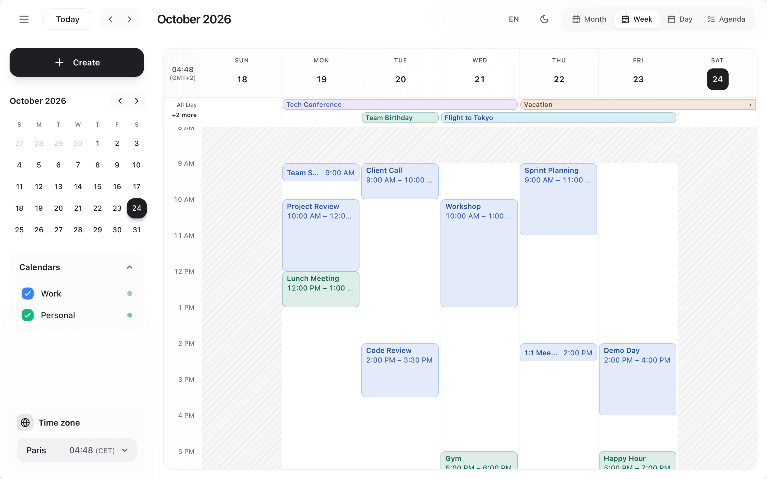
Three built-in themes, each in light and dark: calm (default, neutral), vivid (saturated, the closest to 1.x) and editorial (warm tones, serif titles).
<Scheduler theme="vivid" mode="system" />

// Adjust a preset (a 1.x theme object keeps working: it applies on top of `calm`)
<Scheduler
  theme={{ preset: 'editorial', colors: { primary: '#0b7285' }, borderRadius: '8px' }}
  mode={darkMode ? 'dark' : 'light'}
  onThemeToggle={() => setDarkMode(!darkMode)}
/>modeis'light','dark'or'system'(follows the operating system).isDarkModestill works as an alias. Without either, the calendar turns dark inside a.darkelement, as in 1.x.- Every colour is a CSS variable on
.ck-root, so plain CSS can override any of them:--ck-background,--ck-foreground,--ck-muted,--ck-muted-foreground,--ck-accent,--ck-border,--ck-primary,--ck-primary-foreground,--ck-ring,--ck-destructive,--ck-destructive-foreground,--ck-warning,--ck-event(events without a colour) with--ck-event-ink-lightand--ck-event-ink-dark, and--ck-radius,--ck-font,--ck-font-display. - Events are drawn per theme: a tint with coloured text (calm), the solid colour with white text (vivid), a card with a coloured top edge (editorial). Today's date is a rounded square, a circle or an underline.
.ck-root { --ck-primary: #0b7285; --ck-ring: #0b7285; }
.ck-root[data-ck-mode="dark"] { --ck-primary: #66d9e8; }- The themes name their fonts (Instrument Sans, Plus Jakarta Sans, Newsreader) but do not download them, so the calendar never calls a font service: load them yourself (Google Fonts, Fontsource) or the system font takes over.
Styles and Content-Security-Policy
The <Scheduler> adds its stylesheet to the page once, as an inline <style> (hoisted into <head> on React 19). With a Content-Security-Policy that forbids inline styles, to cache the CSS as a file, or to avoid unstyled content before hydration on React 18 server rendering, turn the injection off and import the same stylesheet:
import 'calendarkit-pro/styles.css'

<Scheduler injectStyles={false} />
Every class is prefixed with ck: and the reset only applies inside .ck-root: the calendar never restyles your page, and works the same with Tailwind 3, Tailwind 4 or no Tailwind at all.
Size or space the calendar with className (className="h-[600px] rounded-xl"): the stylesheet comes first in <head>, so your classes win ties. Its classes are not in a cascade layer, so on a Tailwind 4 page (utilities in @layer utilities) use the important modifier (h-[600px]!) or size a wrapper element instead.